Typography as Information
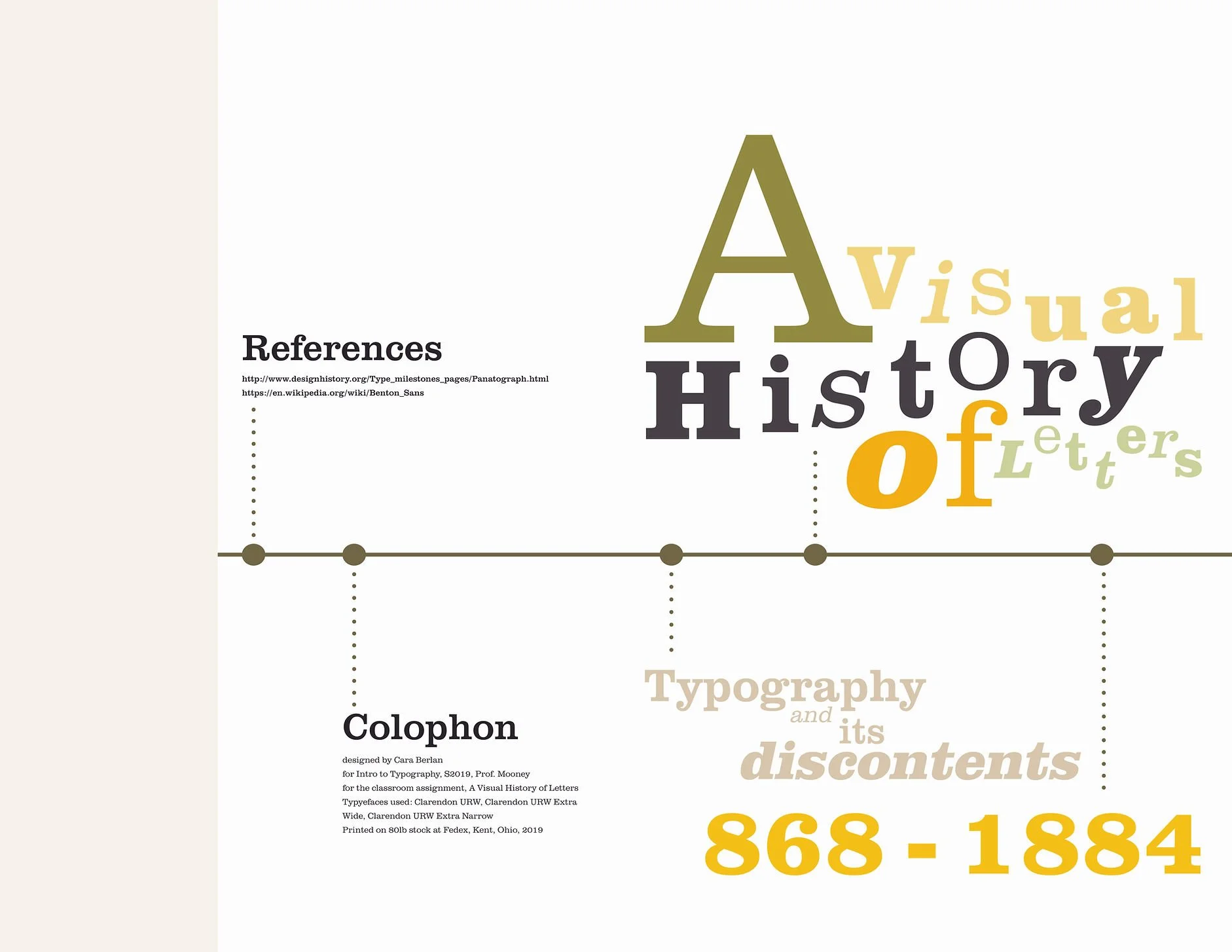
For Intro to Typography, our class was tasked with creating a broadsheet about a specific type family. I chose Benton Sans. I wanted to showcase the various weights and styles of this family so I created a collage of the alphabet using all of the font styles. I believe this creates an engaging image at face value, but once you look deeper, you can see all of the variations available. I wanted to created simple graphics that showcased as much information as possible so the reader wouldn’t be overwhelmed with the amount of words on the page. Because of this, the main content of this spread is split up between a timeline, graphic, and a short blurb on the invention of Benton Sans.

