Ritzy: A Makeup Brand
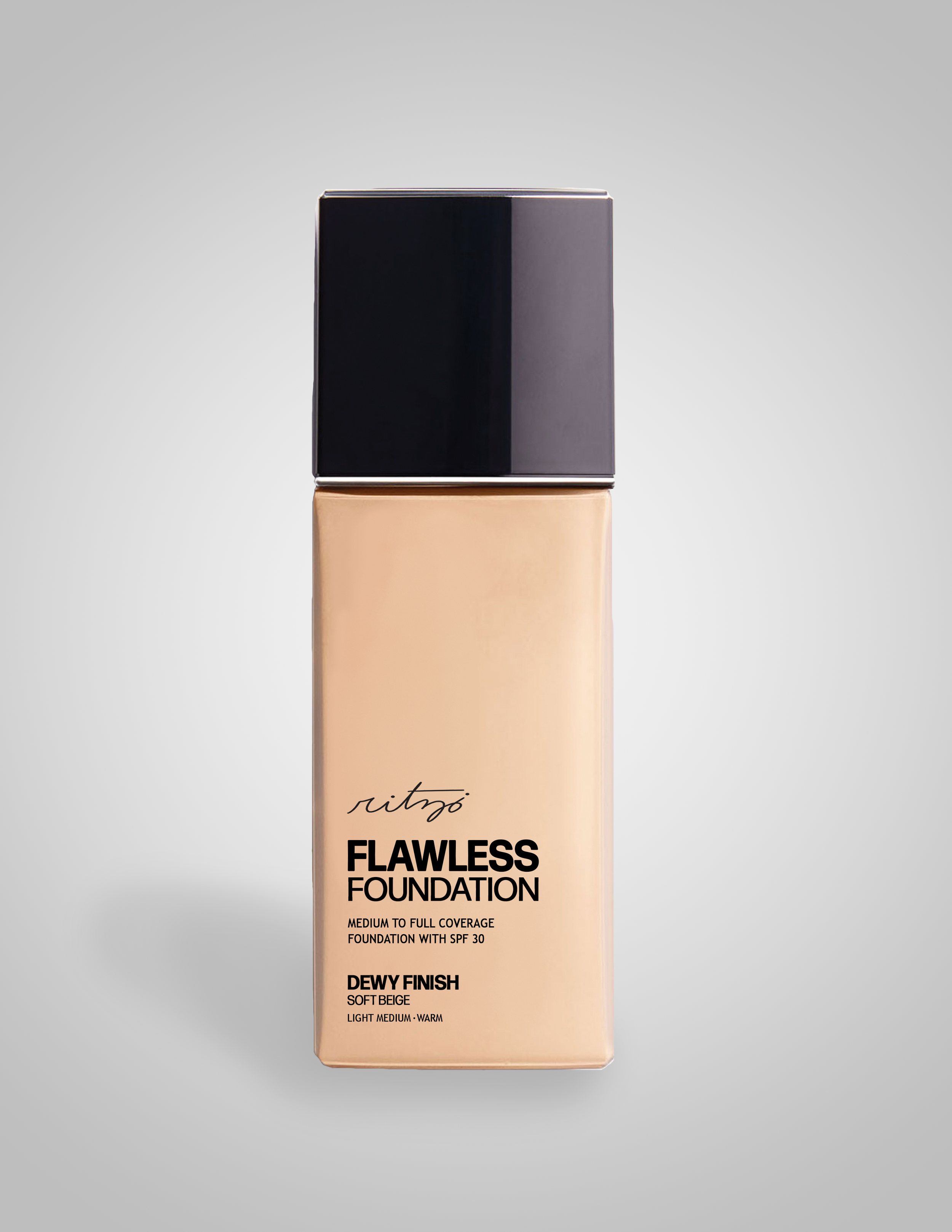
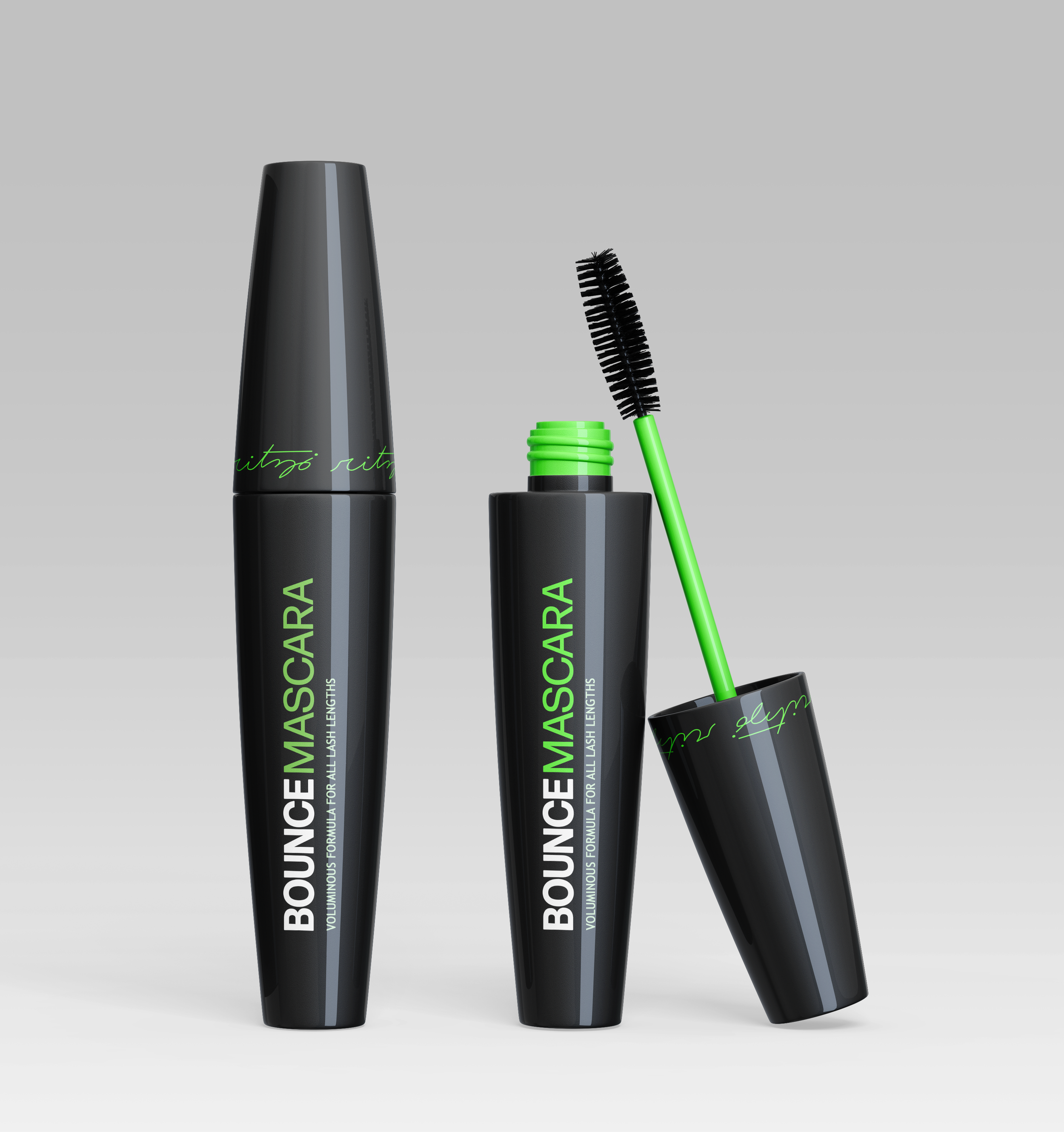
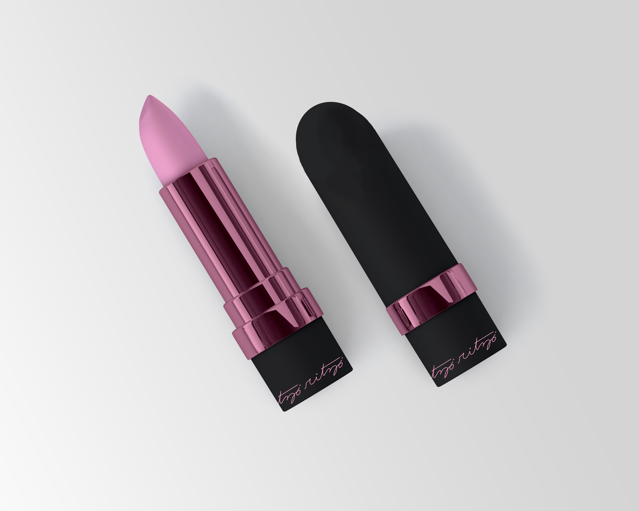
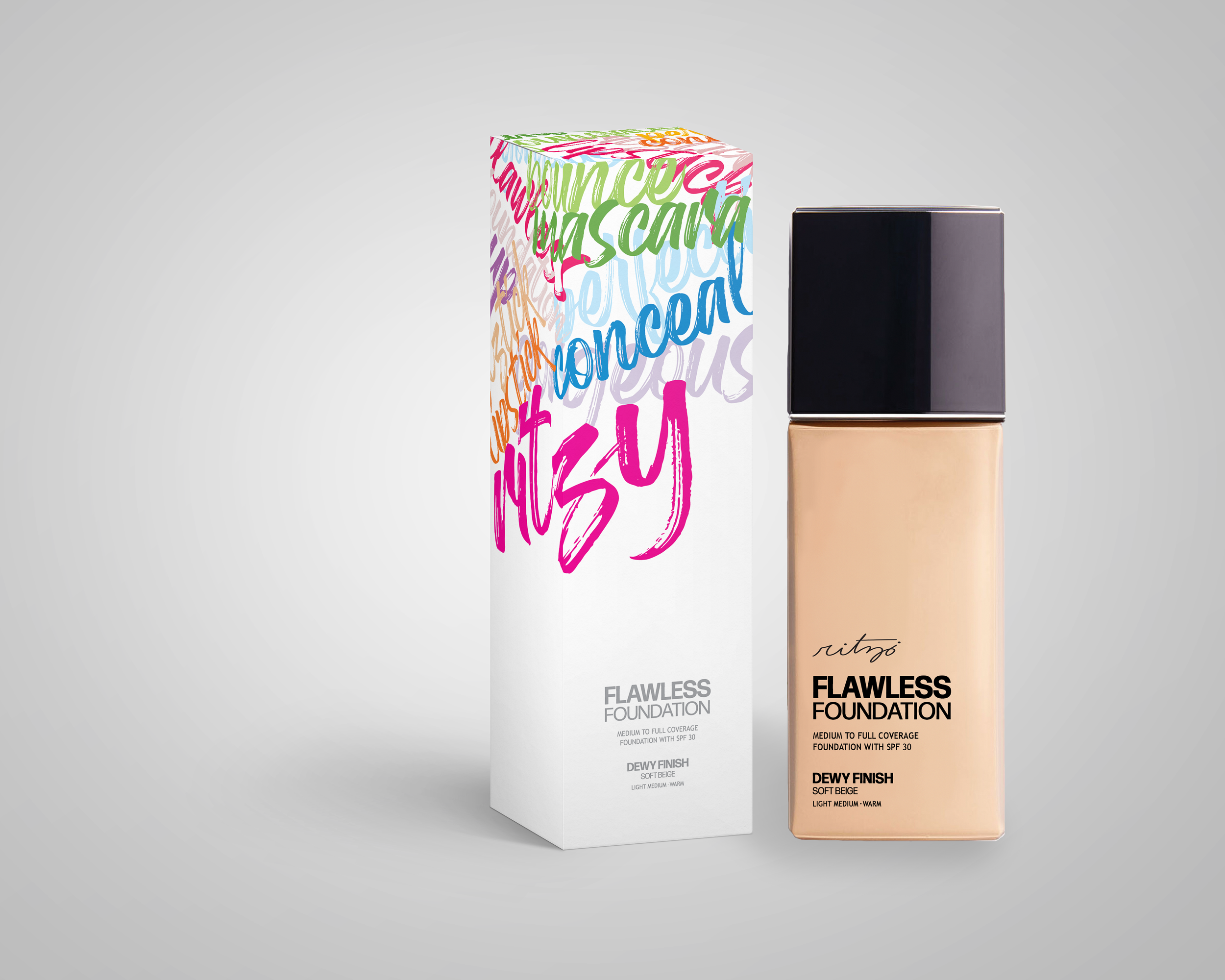
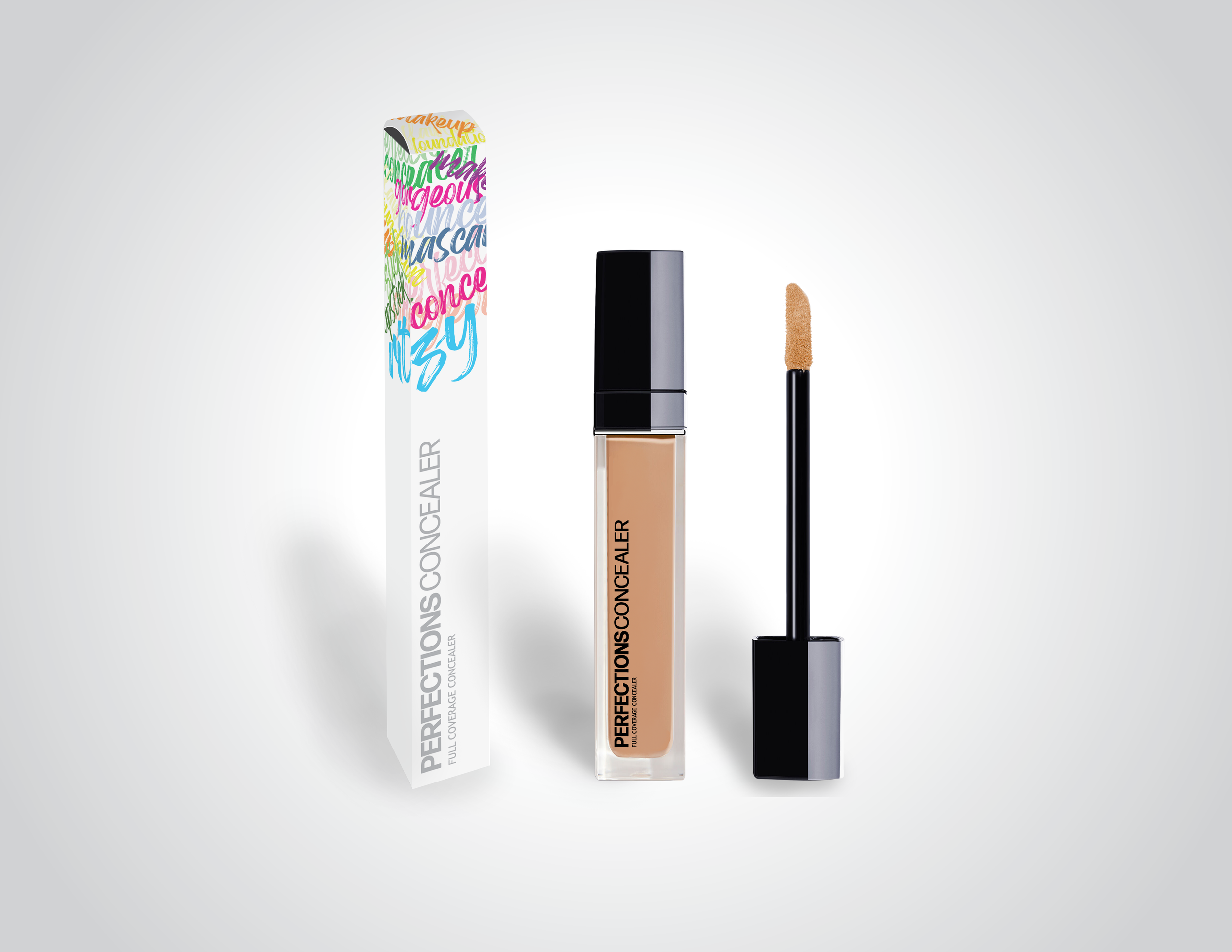
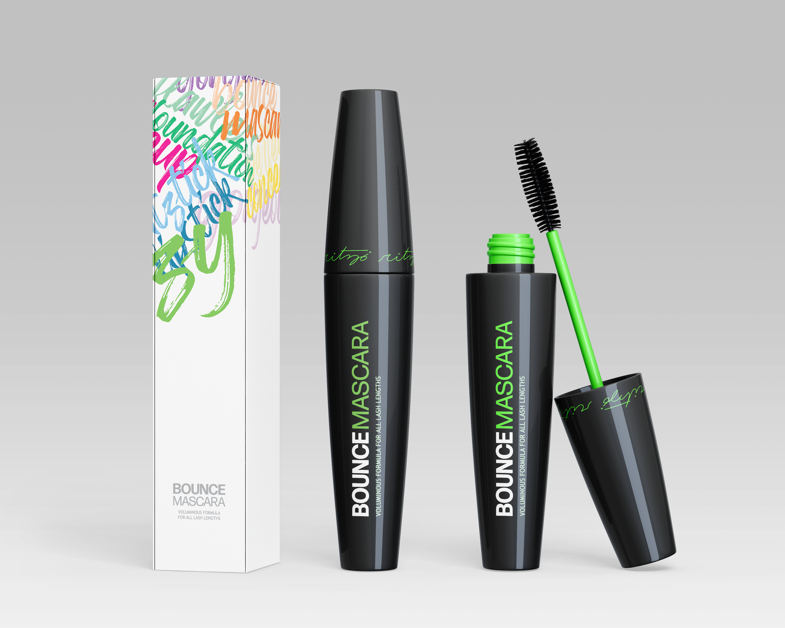
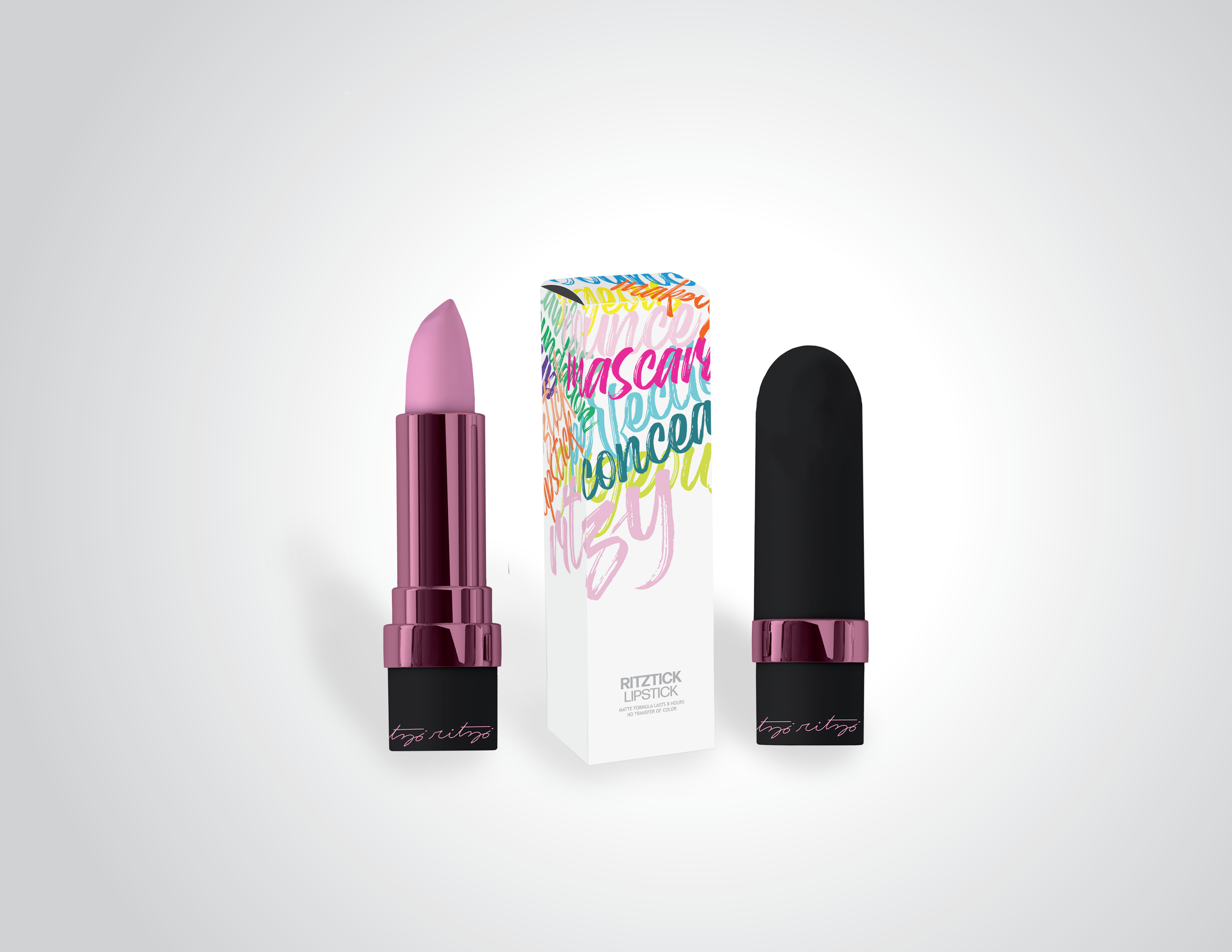
For my senior year Capstone project, I wanted to create what I was most passionate about; packaging for a makeup brand, my makeup brand. I came up with the name Ritzy after the nickname of the house I lived in at the time. I designed a logo that would appear on packaging and products. My professor said he enjoyed my script writing and that he thought I should continue in that direction. I made the logo a thin script font so it wouldn’t take too much away from the bold typography on the rest of the packaging and products.
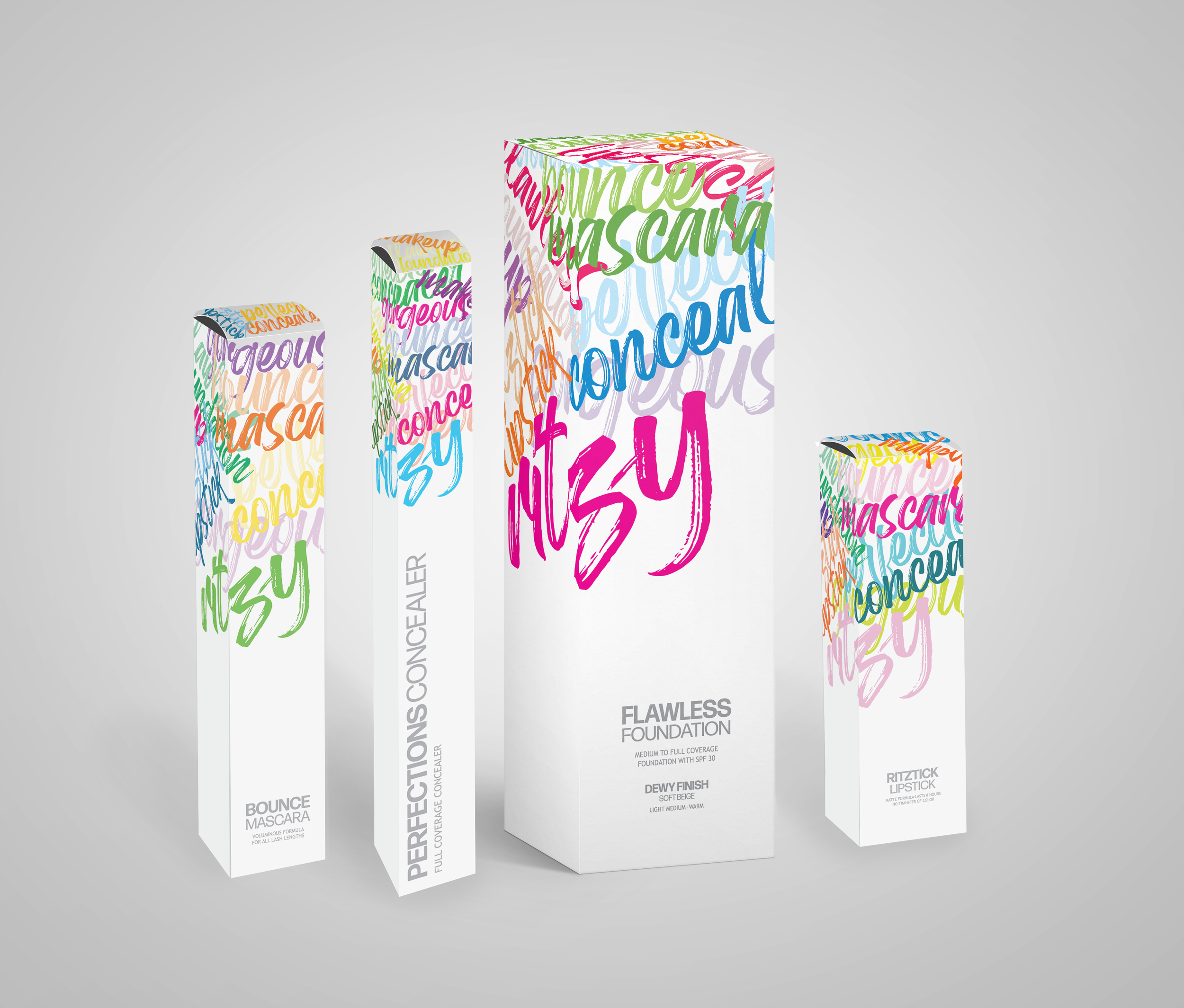
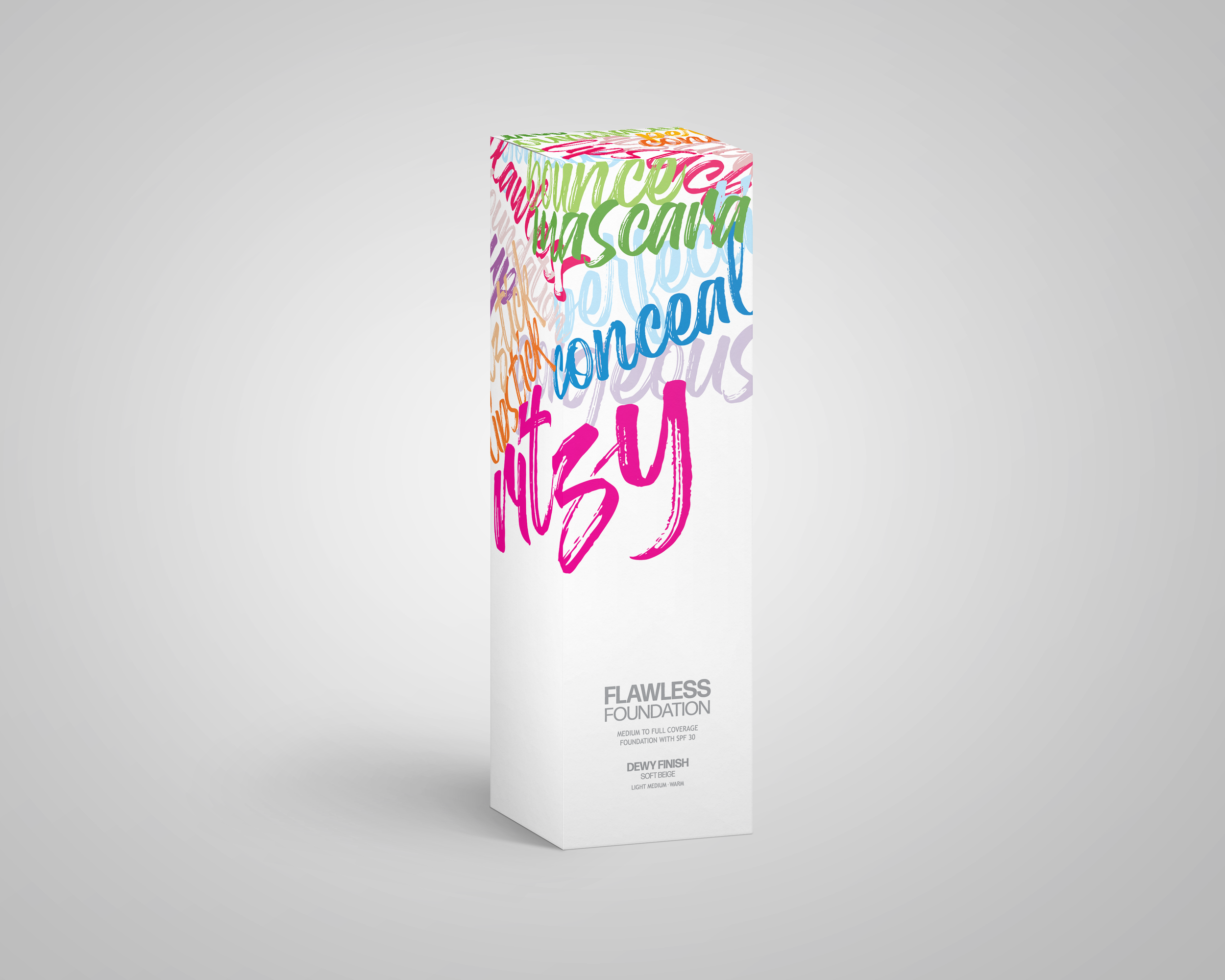
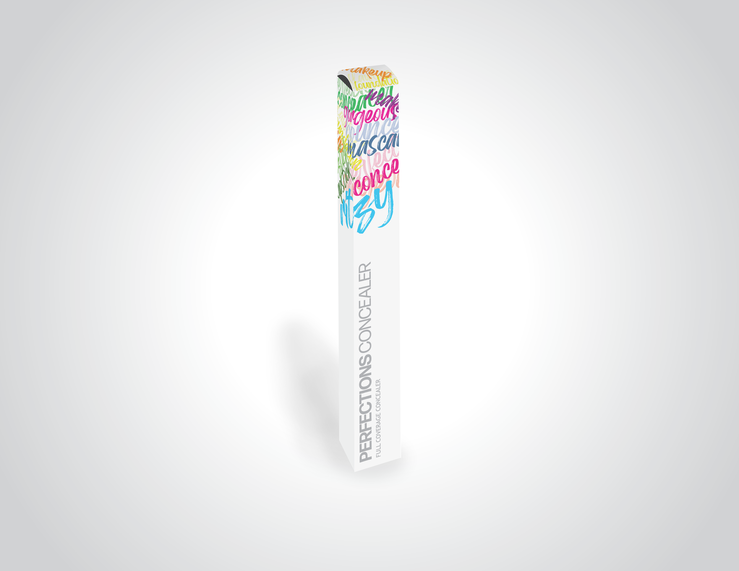
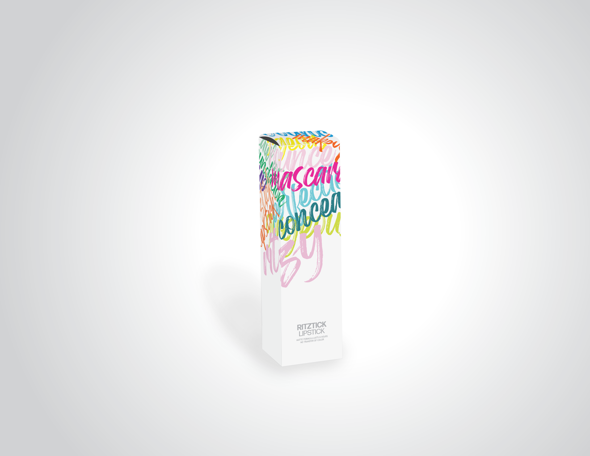
For the packaging, I wanted to make it bright and colorful since this brand represented what I stand for: being bold, standing out, and walking your own path. I believed the bright colors on the white background would stand out from the other makeup brands in the market. The script on the top halves of the packaging was made to be its own pattern of sorts; showing how powerful typography can be when we bend it outside the norm.
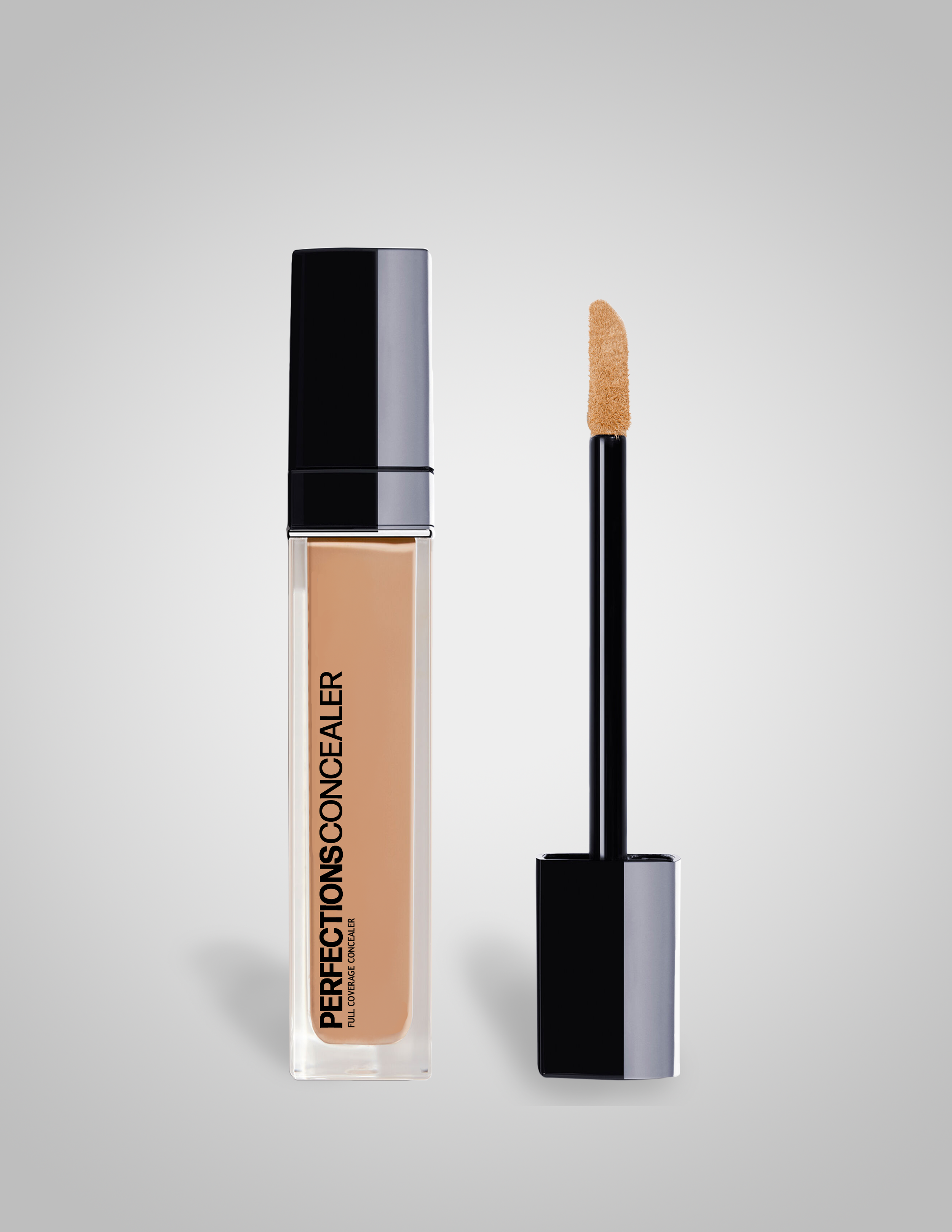
Even though I enjoy using typography in creative ways, I wanted to make the typography on the products and lower half of the packaging clean and concise to clearly label the product. I understand that makeup can be daunting and overwhelming for consumers and I never wanted my customers to question what a product was used for.
Ritzy is for artists, beginner and advanced, that aren’t afraid to try new makeup looks, experiment with color and technique, and most importantly, aren’t afraid to “dance” on their own. I believe the bold and colorful packaging delivers this message.
